Meet
Birdseye
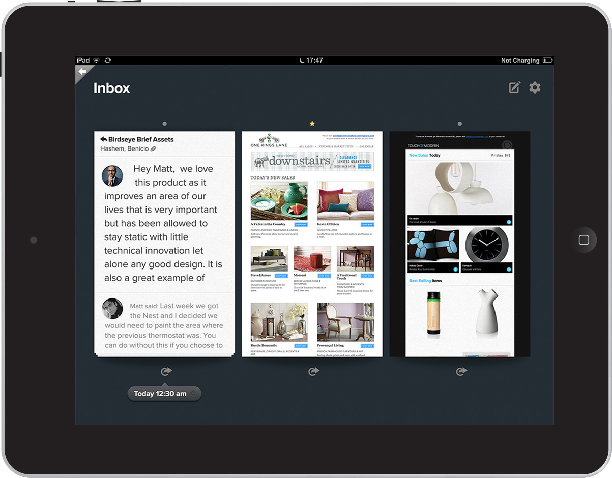
In 2012, NYC-based startup Dede brought me in to design the UX for their iPad app, Birdseye, the first email client built from the ground up for tablets.
The inbox experience of email clients has not adapted to the changing nature of digital communications. Today our emails are more visual, information-rich, actionable. In addition, today's devices are more advanced and innovative. To bring them together, I started with these questions:
 How do we use email today?
 How do we organize?
 What actions do we take after reading?
Looking for answers, I explored combining the various types of emails we receive with the natural actions we take with our similar daily mail. "Mail from niece is to read, discount offers goes to recycle, credit card application goes to shredder…".
Although many features (eg. flags, spam folder) are available for similar actions in the existing email clients, how we **interact** with them is very utilitarian: expanding folders, scrolling rows of emails, clicking on tiny icons… The exact patterns had been carried to iPad mail apps.
With Birdseye, I have designed a set of intuitive interaction models to establish these tasks using the multi-touch screen of the iPad.
Layout
With large email tiles, you get a sense of the content for each email before you dive in. To find the zen while managing lots of emails, Birdseye shows you three emails at a time for increased focus while fast and easy scrolling is established via background loading for browsing past emails.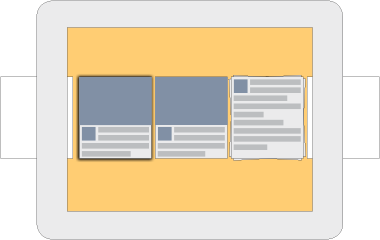
Navigate
Rather than the traditional folders & rows navigation, I designed a more intuitive map-like navigation in Birdseye. You can pinch in and out of folders, threads and individual emails in full screen. While you get a snapshot of the content in the email cards, you can get a sneak peek into threads by pinching in half-way (similar pattern of sneak peeking into albums in Photos app).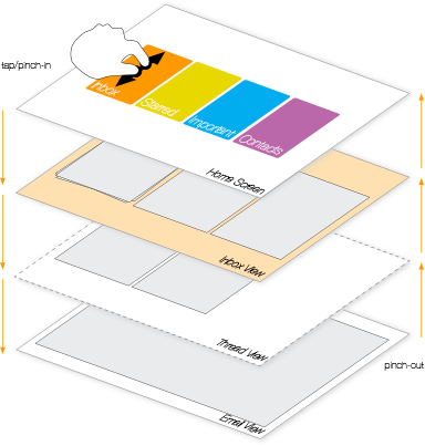
Organize
Use your fingers as you wish.
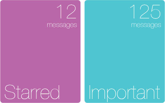
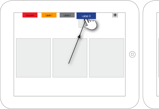
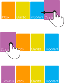
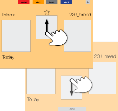
Drag folders to reorder. Flick down an email to archive, flick up to prioritize. Drag down to delete or spam, drag up to put it in a separate folder.
Take Action
Today, what we do with an email is way beyond replying all (many times, by mistake). We visit the linked in profile of the user after a linked in email, we look for the tiny unsubscribe link in a newsletter, we track a package once we receive shipment email.
Birdseye makes it easy to take these actions by contextually looking up in each email and giving you shortcuts you can access even without opening the email.
What Did They Say?
“It's all hands on.”
Liz Gannes - All Things Digital
“They did a bang-up job making email look good. Swiping through emails like playing cards is an intuitive experience that really is unlike any other email client...”
Nathan Snelgrove - Appstorm
