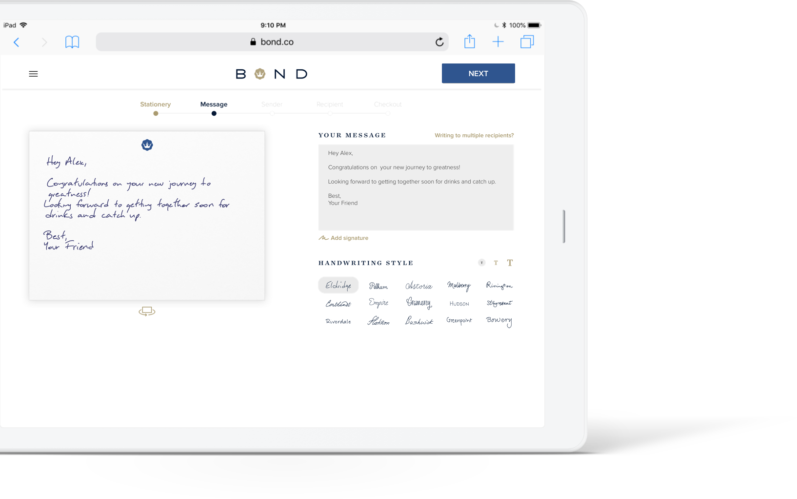
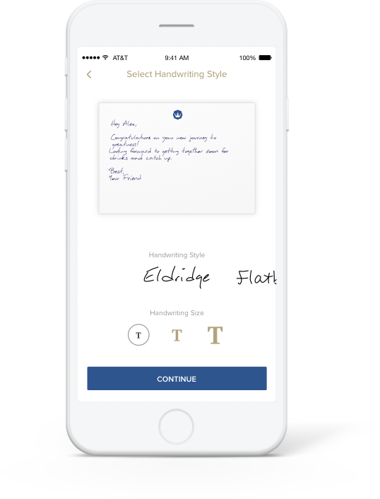
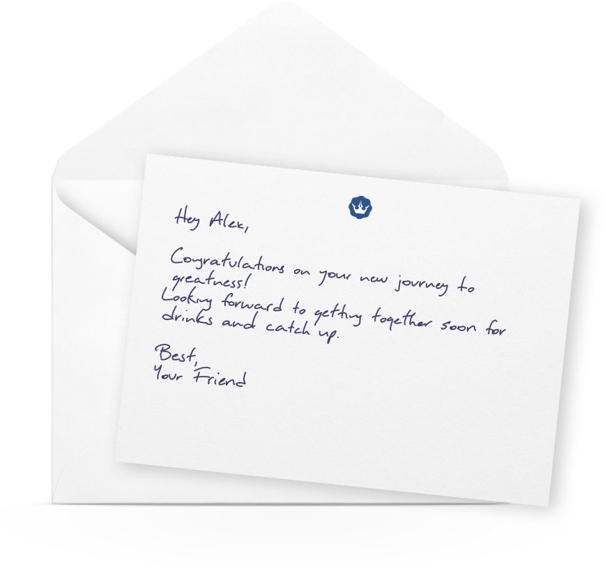
Writing a Physical Note in a Digital Experience
As we merged technology and physical communication in this experience, I utilized the basic affordances on sending a handwritten note to create the most natural user flow online.
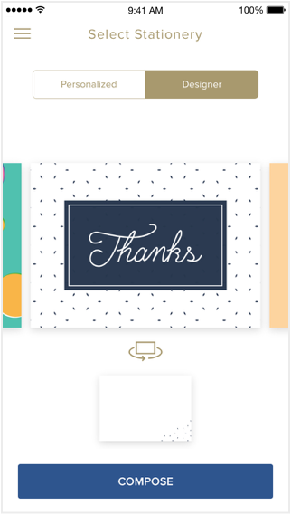
Select Stationery
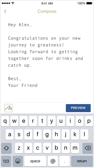
Compose Message
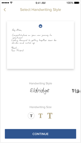
Personalize
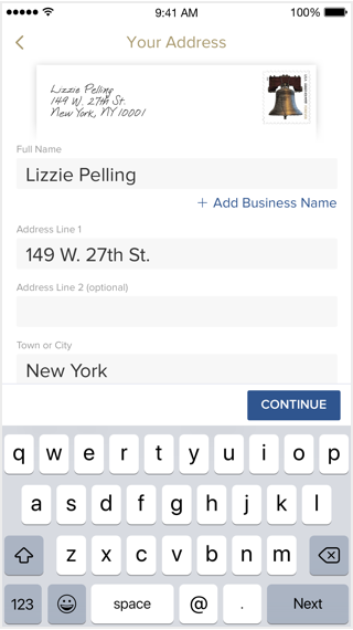
Provide Address
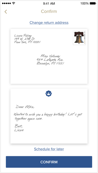
Review and Checkout
Scalable architecture also enabled additional features for business customers to create marketing campaigns, write dynamic messages with mail merge fields, and send notes to multiple recipients at once.
Behind this simple experience lies a very sophisticated background process: As the user hits "send" button, a custom stationery is ordered, handwriting is digitized, a note render is generated, QA’d, written by our robots, and shipped to the recipient. To accomodate this flow, we also designed Skyfall, our internal administration platform for multiple internal stakeholders to follow through and complete this process.
Research, design, prototype, test, develop, launch.
All in just 2 months.
In this fast-paced startup environment, my team applied a complete user-centered design process while launching products within very short timeframes.
We created dozens of high and low fidelity prototypes, and conducted a variety of online, offline and 1-on-1 user tests with over 50 participants. Through this process, we designed the most natural flow that lets users navigate this multi-step process. We also validated many internal ideas and communicated the nuanced transitions to our developers with detailed prototypes.
The result:
4,000 Monthly Active Users
4.8 Star Rating in the App Store
600% Annual Revenue Growth
7x Increased Order Fulfillment Speed
3 years after its successful exit (acquired by Newell Corp.), Bond has shut down its doors in 2019.
