- Client: Hammerhead
- Role: Director of UX
- Dates: 10.2019 - 08.2020

I have been tasked by Hammerhead to design the best cycling computer experience that matched their fantastic hardware, Karoo 2. Little did I know that a cycling computer has the most challenging design requirements a designer could work on.
- A customizable interface that has to serve a ton of data on a rather small screen. All while riding on tarmac or cobblestones, under a full sun or heavy rain.
- A navigation and interaction architecture that has to work both with the touch screen and the physical buttons, even with winter gloves on.
- A notification system that should alert the cyclist at the right moment within the minimum amount of screen-time while they keep their eyes on the road.
Prototypes. Lots of Prototypes.
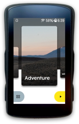
With all these challenges in mind, I paid special attention to common affordances and utilized screen transitions to allow users orient and navigate easily within the OS, without wasting any screen estate with breadcrumbs or navbars. I designed the whole OS work with a simple yet logical navigational system using only “back” and “submit” buttons. This enabled users to navigate the software also with physical buttons, when touch-screen is locked in harsher conditions.
I created dozens of high fidelity micro-prototypes to test the viability of our designs and to communicate the functionality and transitions to our development team.
“The overall navigation and display experience is unlike anything else out there.”
“The best GPS cycling computer you divare not using.[...] The overall experience —pre-ride, during ride, post-ride—seems simpler, cleaner, and smoother than anything else.”
“[It] is simple to operate. I'd even go as far as to argue it's more intuitive than that of its rivals, Garmin and Wahoo included.”
Within a year of launching Karoo 2, Hammerhead got acquired by SRAM, one of the most reputable cycling components brand.
