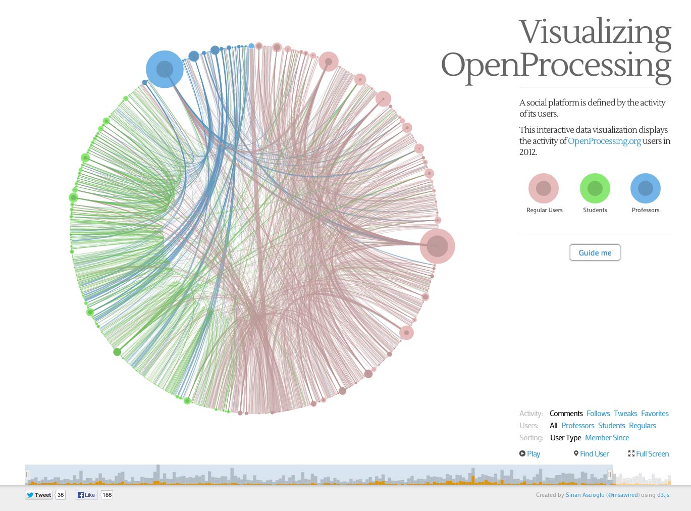
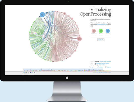
I wanted to understand the emerging patterns behind how users interact with each other on OpenProcessing.
That’s why I developed Visualizing OpenProcessing, an in-depth analysis project of user segments and behavior on the platform.
Timeline
You can select the time duration displayed in the visualization.
In slower devices, timeline limits the time duration selected without effecting the performance.
Visualization
Each user is represented with two circles:

Regular User

Student

Professor
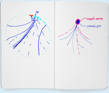
 Outer circle represents the activity user received.
Inner circle represents the activity user posted.
Interactive Step-by-step Guide
This guide walks you through the various levels of the visualization as well as highlighting various patterns that emerged.
Filters, Sorting and Options
Data displayed can be filtered by activity and user type. You can also play the selected time duration as timelapse.


